Parking Pilot UI design

DESIGN
Prototypes
The little testing we did was through a high-fidelity prototype we set up in the InVision app, which was used for A/B testing. Yet again, we lacked methodologically defined approach to it, so we did not collect data on it sufficiently. However, it did show us some insights, but ever since the InVision app and the field of UX design grown (and my understanding of it too), so now I would prepare a more meticulous testing.

Final Screens
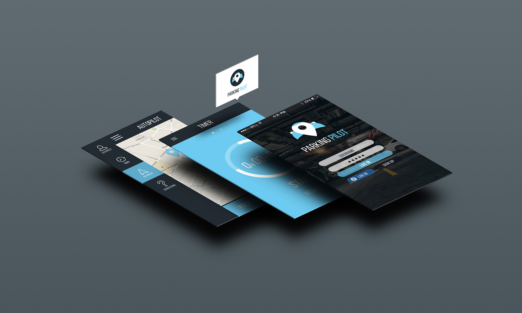
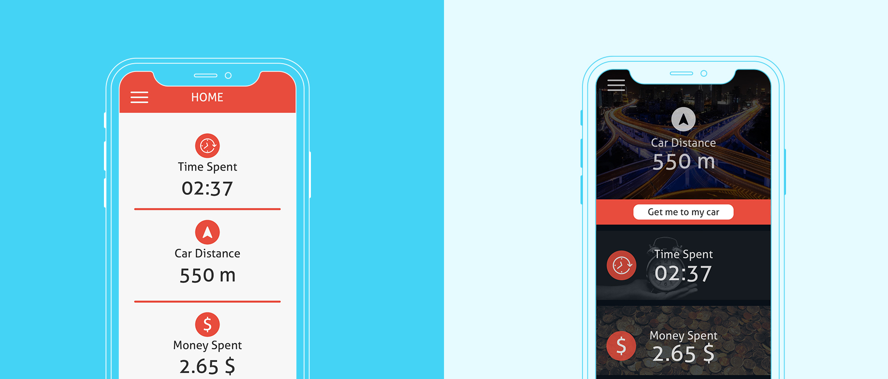
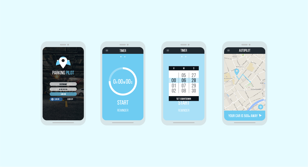
The final screens were developed based on the style guide and our presumptions, so I feel like some usability issues are present with them. The navigation through the app does not seem to be that obvious, but more testing could prove or disprove this.

Further comments
I mostly concentrated on the flaws of this project, and there have been many, but it is also true that our process was not entirely wrong, we just lacked knowledge of UX methods and the importance of user feedback. Nonetheless, this project was an important milestone in my design development, as it highlighted my interest in the creation of interactive interfaces.